Data are everywhere. Turning them into information – and then information into knowledge – requires learning about analysis and visualisation skills from the best in the business. At the Economics Observatory, we believe this is vital for good scientific communication and effective policy-making.
Newsletter from 24 February 2023
Data visualisation skills are becoming increasingly important for economists and many other pursuits. In today's world, we generate data at an unprecedented rate – one zettabyte per year. You would need around 15.6 billion smartphones to store this quantity of information.
This means that for all practical purposes, data are unlimited – yet our attention remains limited. It is therefore essential to be able to communicate the insights hidden within data in a clear and concise manner. There are currently two main routes for extracting these insights:
- We either let a machine summarise the data for us: hello to machine learning and artificial intelligence.
- Alternatively, we try to make sense of the data by ourselves. In this case, it is likely that we need to visualise them first.
One-third of the human brain is dedicated to processing visual information. This means that data visualisation can be powerful tool, not only for making sense of the world around us, but also for unpicking vast datasets. As a result, learning data visualisation skills can provide significant benefits for anyone. In this newsletter, we take a tour of the best books that can help you to acquire and develop these core skills.
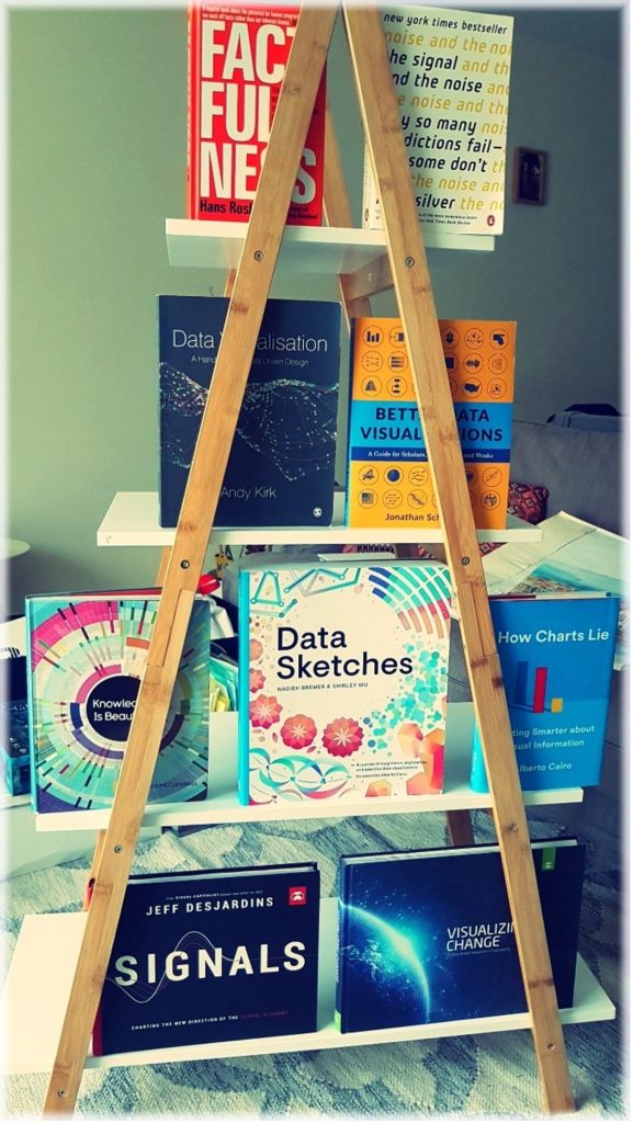
Photo provided by author
Data: making sense of complexity
One of the primary benefits of data visualisation is that it allows complex information to be communicated in a way that is easily understandable to a wide audience. This is especially important when presenting research findings to policy-makers or the general public. Rather than presenting data in tables or charts that may be difficult to interpret, data visualisation enables scientists and professionals to present information in a visual format that is intuitive and easy to understand.
The Visual Display of Quantitative Information by Edward Tufte is the classic book of the field. First published in 1983, it has become a standard reference for anyone interested in creating effective and elegant visualisations. It includes examples of good and bad graphics, and provides practical advice on the design and implementation of graphical elements.
Factfulness is a book written by the late Hans Rosling, a renowned statistician and public health expert, along with his son and daughter-in-law, Ola Rosling and Anna Rosling Rönnlund. It offers a refreshing perspective on global trends and challenges, countering many commonly held misconceptions and pessimistic outlooks.
The authors argue that the world is much better off than we often think. Factfulness provides readers with a framework for understanding global trends and data in a more accurate and nuanced way. Through engaging anecdotes and data visualisations, it encourages readers to think critically about the information that they consume and to approach complex problems with a fact-based, optimistic mindset. This is an essential read for anyone interested in global trends, data analysis or critical thinking.
Information: identifying hidden patterns
Another benefit of data visualisation is that it can help us to identify patterns and relationships that may not be immediately apparent from raw data. By using different types of charts and graphs, we can quickly identify trends and highlight outliers, which can help us to make more informed decisions. This is particularly important when dealing with large datasets that may be difficult to analyse using traditional methods.
Visualise This by Nathan Yau focuses on creating effective visualisations using the three main open-source tools available: R, Python and D3.js. The book is a great resource for anyone who wants to learn these tools and provides practical guidance, including code snippets and case studies. Yau's blog flowingdata is also well worth a visit.
Better Data Visualisations – A Guide for Scholars, Researchers, and Wonks, by Jonathan Schwabish, is another comprehensive guidebook for those looking to improve their data visualisation skills. Schwabish is a fellow of the Urban Institute and his writing style is engaging and accessible, and his approach is rooted in the principles of good design.
Figure 1: First full-flowering day of the cherry blossom in Kyoto, Japan, over the past 1,200 years
Source: Chart from the Economics Observatory’s ECO magazine, Issue 2, based on The Economist. The cherry trees in the gardens of Kyoto’s main temple blossomed on 26 March in 2021, the earliest show of colour since the custodians of the temple started recording the data, more than 1,200 years ago.
Knowledge: telling a story
Data visualisation is not a substitute for sound analytical skills. It is essential that people creating data visualisations have a solid understanding of statistical methods and data analysis techniques before they can effectively use visualisation to communicate their findings. The analysis should be conducted with the ultimate purpose of finding the correct context.
For data to become information, we need to extract what is useful from them. In turn, this information only becomes valuable – that is, knowledge – when placed in the right context. If used in the wrong context inadvertently, then it becomes disinformation, or even worse, if done deliberately with a deceptive intent, it is misinformation. This three-step process is often called the data story.
Storytelling with Data andStorytelling with You by Cole Nussbaumer Knaflic focus on using data visualisation as a tool for engaging audiences and storytelling. Both include numerous examples and case studies that demonstrate how to use data visualisation to communicate complex information in a way that is easy to understand.
Climate Stripes by Ed Hawkins is a great example of effective visualisation. This minimalist ‘barcode’ type visualisation depicts average global temperatures with vertical lines, telling the story of global warming better than ever before.
Figure 2: Climate stripes
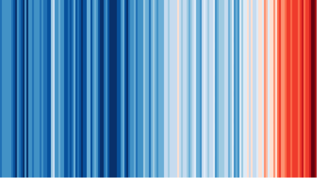
Source: Ed Hawkins
Where to start?
Data Visualisation: A Handbook for Data Driven Design by Andy Kirk is probably the best entry point for newcomers. It covers a wide range of topics, from basic principles to tools and techniques for creating visualisations, and tips for presenting data effectively.
We cannot have a newsletter on data visualisation without mentioning the name Alberto Cairo, professor and author of several books on the subject, including The Functional Art, The Truthful Art and How Charts Lie – the last paraphrasing a classic book, How to Lie with Statistics by Darrell Huff. Cairo’s books offer a comprehensive and insightful exploration of data visualisation (often highlighting the ‘gone wrong’ aspect), and are a must-read for anyone interested in data visualisation, whether beginners or seasoned professionals in the field.
Practical tools
At the Economics Observatory, we follow the principles of the Vega visualisation grammar developed by the Interactive Data Lab, led by Jeffrey Heer at the University of Washington. We use their in-browser visualisation editing tool – Vega-Lite – for most of our charts. The group is widely considered the de facto leader of the field and has its origins in the Stanford Visualisation Group – which spawned the most advanced data visualisation tool to date: D3.js (formerly Protovis).
But D3.js has a steep learning curve – and we want our charts to be as accessible and replicable as possible for our audience. Therefore, our more complex visualisations like maps are developed in D3plus (D3.js ‘lite’), spun off from Cesar Hidalgo’s former group at MIT Media Lab.
Figure 3: A selection of charts from the D3.js gallery on Observable
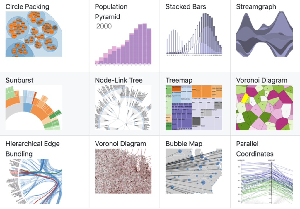
Source: Observable
Which chart to choose? Enter the zoo
The Data Visualisation Zoo is a concept developed in 2010 by Jeffrey Heer and colleagues (building on Andrew Abela’s Chart Chooser from 2009). It is a collection of over 100 different types of charts and graphs, organised by categories such as distribution, relationship, comparison and composition. The purpose of the Zoo is to help people choose the most appropriate chart or graph type for the data they want to represent.
In 2014, Jonathan Schwabish formalised the Zoo in the Graphic Continuum, which was later developed into the Visual Vocabulary by the Financial Times. The idea behind this is to provide a common language for visualisations, allowing people to recognise and understand the different design elements used in them more easily. You can start by exploring the Vocabulary conceptually or by editing the examples in Vega, PowerBI or Tableau, or any other tool.
Alternatively, if you just want to look at some beautiful infographics, Information is Beautiful and Knowledge is Beautiful by David McCandless have got you covered. Personally, I like to start my day with Beautiful News.
If you’ve enjoyed this newsletter, keep an eye out for a follow-up in the spring, which will focus on using machine learning and artificial intelligence to extract insights from data.
Observatory news
- We’ll soon be announcing details of this year’s Festival of Economics in Bristol in November. One speaker we are excited to confirm already is Ed Conway, the Data Editor at Sky News. Make sure you follow Ed on Twitter for lots of fantastic charts and sharp commentary. He also has a new book, Material World, on the way, which you can pre-order here.
- You can also visit our Data Hub, a live deck of charts that make sense of the latest numbers. Over the coming months, we plan to scale up this part of the website, bringing you a suite of new interactive features for finding, displaying and sharing data.


